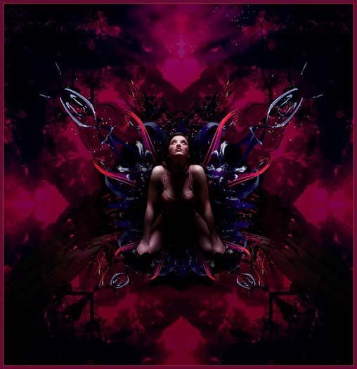
06 May Creating Fantastic 3D Effect in Photoshop

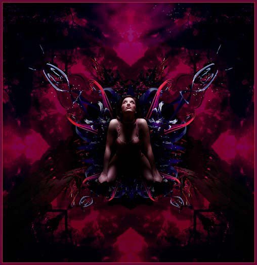
Today’s tutorial we will present how to create fantastic 3D effect in Photoshop. In this tutorial we will show you abstract manipulations with multiple photographs and renders is a great way to make an explosive action packed piece of art and by creating depth and movement it looks really bland scene. So, let’s have a try…
Step 1:
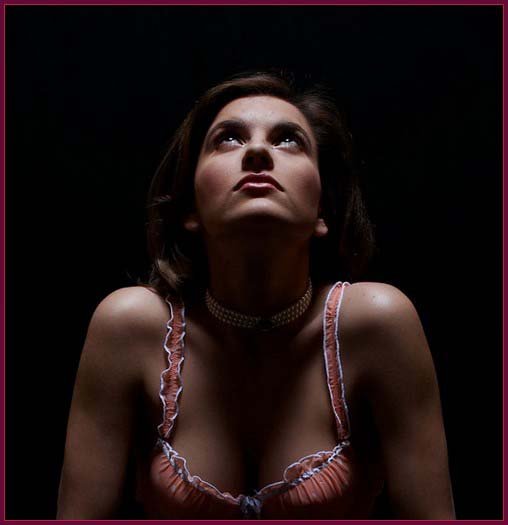
The first thing we’ll need is a model lucky you, we have provided one ! free stock images are a great way to learn photoshop manipulation and you can find plenty at different websites (such as sxc.hu). This is a good shot in that the model is well lit and very obviously focusing on a point directly above her – a strong beginning that suggests a direction for the rest of the manipulation!
Step 2:
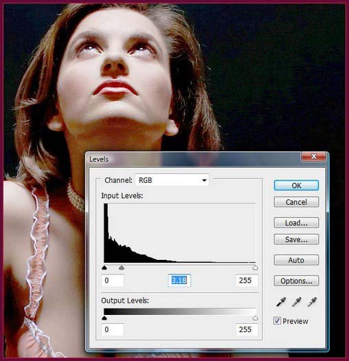
This is a very dark shot that makes some edges hard to spot – a trick here is to add a Levels adjustment layer and drag he Midtones sharply towards the shadows. This will blow the highlights up and make etching much (did i mention much) easier. Zoom in nice and close on the photograph – around the 400% mark should get you a nice accurate result.
Step 3:
Now, pull out your Pen (P) tool and start tracing around the model carefully. The more anchor points you use the better. Once you have completed a perfect trace of the girl, complete your work path by re-clicking on the original anchor point.
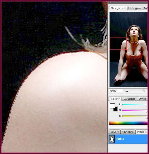
Ctrl-click/right-click in the center of your path and hit Make Selection. Ensure the Feather Radius is set to 0 and that the New Selection radio button is checked.
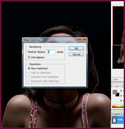
Step 4:
Once you’ve made your selection, hit Cmd/Ctrl-J to duplicate to a new layer. Create a new document at A4 resolution and copy the model into it. Name the layer – ‘model’ that will be just fine.

Step 5:
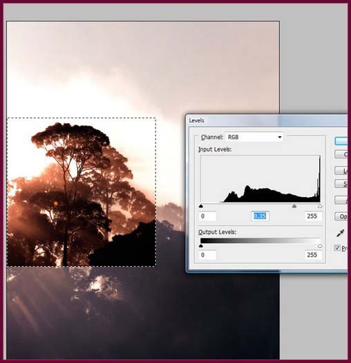
Open the canopy image and duplicate it into your main composition. Select the Marquee tool (M) and hold down Shift to drag out a square selection of the left hand side, incorporating the tallest tree and a section of the silhouetted lower portion.
Step 6:
Hit Cmd/Ctrl-l to bring up the Levels interface. Drag the midtones slider towards the highlights until the shadow area of the piece is perfectly black – around the .062 mark should be perfect. This gives the piece an excellent contrast, excellent contrast importantly, but more importantly will allow us to work other photos in using blending modes to create a richer and more detailed Kaleidoscope.
Step 7:
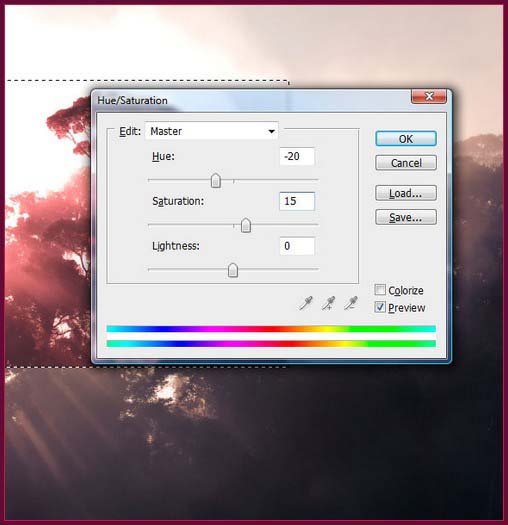
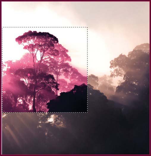
Hit Cmd/Ctrl+U to being up Hue/Saturation panel. Drag the Hue slider left to around the -20% level and the Saturation down to about 15%. Now hit Cmd/Ctrl+B to bring up Color Balance. Drag the Shadows slider slightly towards Blue, Mid tones to Red and the Highlights towards Yellow. Use Hue/Saturation for a second time, moving the Hue -20% again.
Step 8:
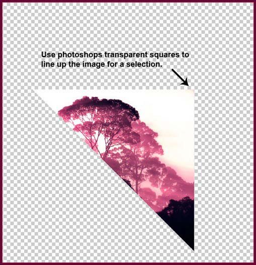
Use the Lasso tool to make a diagonal, selection across the square and hold Shift to force 45 degrees. You might want to use Photoshop transparent squares to line it up perfectly. Once your selection cuts the square into two triangles, cut and paste to a new layer.
Step 9:
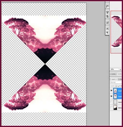
To start building the kaleidoscope effect, duplicate the layer and flip it horizontally. Match the 90-degree edges up and merge the two together. Duplicate again, flipping vertically this time. This time, match the middle point edges and Merge Down.
Step 10:
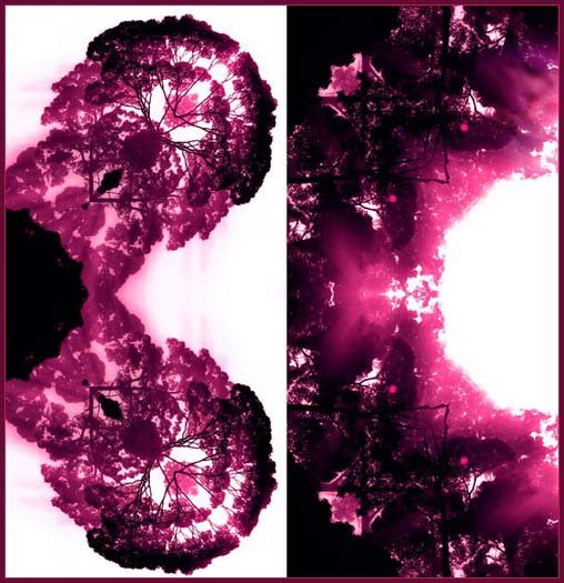
Rotate the merged layer by 90 degrees and merge down to complete your first kaleidoscope effect. Now repeat using the other section from the original: square Marquee to get a neat ‘inverted’ feeling. You can feel free to experiment by repeating the kaleidoscope steps using a different original selection if you desire.
Step 11:
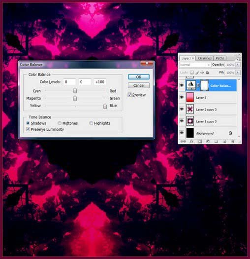
Duplicate your two kaleidoscopes into your At- document, placing the darker one below the lighter Set tl-e blending mode on the lighter effect to Darken. Create a new layer and drag out a gradient from a bright pink to red – set this blending mode to multiply. Top all of this off with a Color Balance adjustment layer that pulls the Shadows towards Blue. Throw all these layers into a group and save.
Step 12:
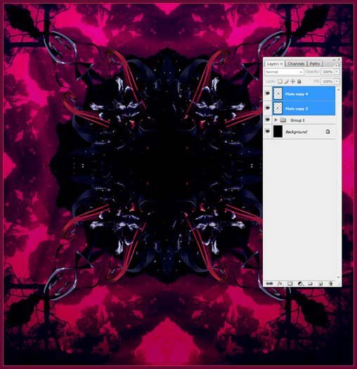
Open up ‘renders.psd’ from downloaded file (please try and use your own illustrations here if desired) Bring in the ‘Main’ layer and apply the kaleidoscope effect to the main part of the illustration. There’s no exact science to this, just use your intuition. Position the result above the background kaleido group.
Step 13:
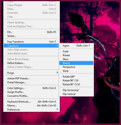
Pinch the bottom of the shape in using the Distort tool (Edit> Transform>Distort) – we’re trying to break the symmetry up a bit, but it’s important to keep the corners tidy. Once this is done, use the Perspective tool (Edit> Transform>Perspective) to pull the top out to enhance the effect.
Step 14:
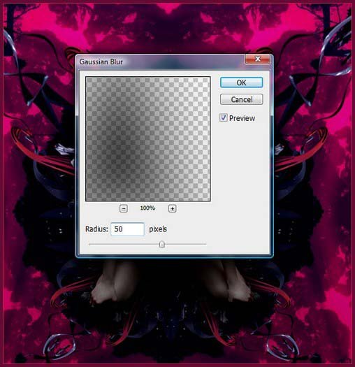
Bring the ‘model’ layer back in to play and place her at the top of the Layers palette. Ctrl-click/right click the layer to get her selection and create a new layer. Fill with black and apply a Gaussian Blur of around 50 pixels. Pop the layer below the model and drag straight down to correspond with the light source.
Step 15:
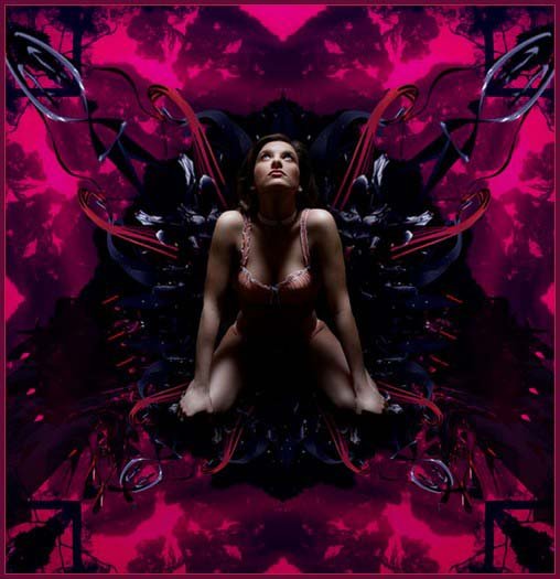
Open up ‘renders.psd’ again and bring in the ‘Double’ layer. Throw it behind the ‘abstract kaleido’ layer and rotate it so that the form disappears out of screen. Duplicate and Flip Horizontal to maintain the symmetry of the piece. Set the layer Opacity to 75%.
Step 16:
Duplicate these two layers and flip them vertically. Position the abstract ‘clump’ above the model’s head (below the ‘abstract kaleido’ in the Layers palette). Add a layer mask and drag out a vertical gradient running white to black from top to bottom to hide the tendrils.
Step 17:
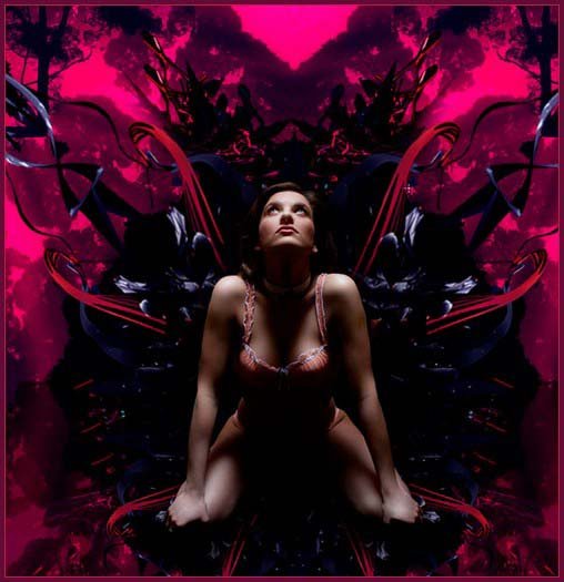
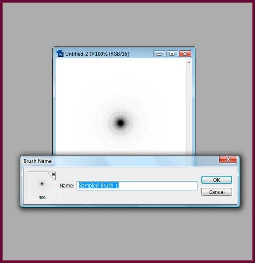
Create a new square document (300 x 300) = and fill with black. Render a Lens Flare in the precise middle. Reduce Saturation to 0 and crunch the Levels by sliding the Mid tones towards the Highlights as before. Hit Cmd/Ctrl+A to select all, then Crmd/Ctrl+l to invert. Define this as a brush (Edit>Define Brush Preset).
Step 18:
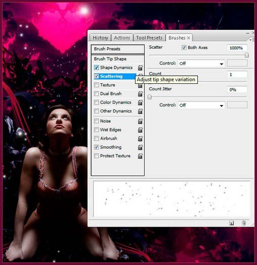
Open the Brushes palette and select your newly made brush. In the Shape Dynamics, turn Size Jitter up to 100%, then scattering up to 1000% on both axes. Create a new layer and brush liberally behind the model, erasing unwanted parts as you go. Less is more, but make sure the effect is present!
Step 19:
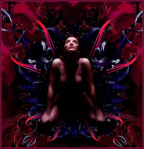
Now that the basis of the image is complete, it’s time to put the finishing touches in by adding fine details. We’ve made a couple of extra kaleidos from the shapes and positioned them symmetrically. We also etched out the lily images that you downloaded and scattered them around before adding more lighting. This is where the magic happens, so take your time to enjoy the techniques we have discussed.
Tip: Adjustment Layers
We talk about adjustment layers a lot and there’s a very good reason for it; we have never released a finished piece of artwork that didn’t have at least two adjustment layers sitting on top of it to unify the piece’s palette and balance the composition out. Applying specifically to this piece, after we finished balancing all of the layers by hand, we had a play around and found that a couple of small adjustment layers worked wonders.
First we added a Color Balance adjustment layer and moved the Highlights quite significantly (around the 25% mark) towards Yellow and the Mid tones fractionally (around 5%) towards Cyan. Setting the blending mode to lighten completed this effect and really made the image pop a little more, while infusing it with a lovely warm tone.
To balance this, we then added a Channel Mixer layer and upped the contrast in the Blue Channel by 10%. Select the automatic layer mask, drag out a Black to White gradient running diagonally from the top right and you have a subtle effect that further breaks symmetry without creating imbalance. Experimentation is key with adjustment layers play with their position in the layer hierarchy, play with their opacity, but always make sure they are there.
Final Result:
Hope you can learn something new from this tutorial.
I feel really glad if you give me feedback through comment below. Soon i am going to show more interesting & innovative tutorials so please keep visit our blog. That’s for now.
Have fun!
Reference: simplypsd

Sorry, the comment form is closed at this time.