
06 Dec Design A Cool Typography Poster in Photoshop

Today I would like to share some Photoshop techniques about how much easy with few basics steps you can create awesome typography posters. With this technique you can create interesting flayer for dance club or you can use in advertisements. Let’s have a try…
To create this design work you will need following design elements:
- “Planet of the Apes” font
- Istockphoto stocks – download my pack
1.Step
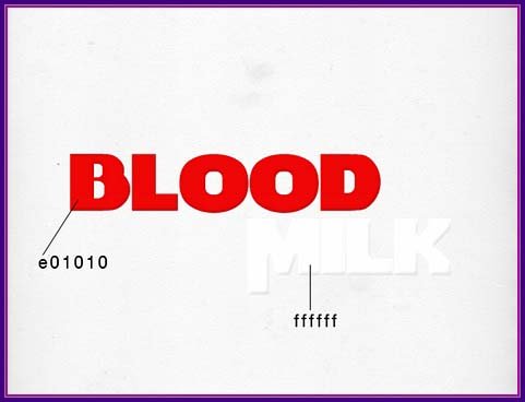
Well, let’s do it! At first I made a light background of the notebook. And wrote the words: “Blood” and “Milk” (using “Planet of the Apes” font) with a little light bevel.
2.Step
Next I used red splash on the word “Blood” with a nice positioning on it. Note the layer “Milk” should be above the rest.


Result:

3.Step
Hereinafter repeat all the same technique only for the text “Milk”. For making a white splashes do the following:


Result:

4.Step
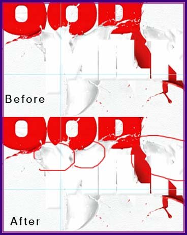
Next we create a new layer on top, take tool “Smudge tool” (R) and be sure to check as shown below:

Making a smooth transition of the text in the splatter:

Result:
5.Step
Hereinafter all the same thing only for the text “Blood”.
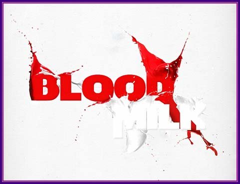
6.Step
Now we will start to the detalization of the work. Create new layer below all the existing layers. Download the white lines by ViniMan. Take Brush tool and add white lines on our new layer. Now we will add some ornament custom shape to the “Milk” like this:

You must have a similar result:

7.Step
Open photo of the girl and cut the girl. Using Transform tool make girl smaller and change it in to black & white mode.

Add girl to the work, below all existing layers:
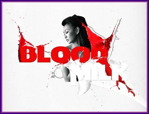
8.Step
Now make a little extra text and its foundation. It’s simply: make two circles of different sizes and add a big symbol “&” like that:

Add this to the work. Add this text below your Blood and Milk layers.
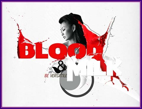
9.Step
It is last step. We will add some extra details. I added a separator line and red lines for the word “Milk” add some lightness and a bit more sharpness.

At this stage we have finished, I hope you learned something new and interesting for yourself.
Final Result:

We are done for now. Looks good as for me! Use it, make it and enjoy your own nice photo effects!
Hope you like this tutorial and find it useful.
I feel really auspicious if you give me feedback through comment below. Soon i am going to show more interesting tutorials. That’s for now.
Have fun.
Credit: psdeluxe.com

Pingback:Separator Line Word | AllGraphicsOnline.com
Posted at 09:11h, 14 March[…] I added a separator line and clippingdesign.com […]