15 Oct Make a Colorful Blog Web Layout in Photoshop

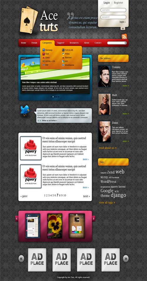
Today I want to show you a tutorial about creating an amazing colorful blog web layout in Photoshop. In this tutorial we will use only basic tools, like rectangle tool, gradient tool, and layer styles. So this tutorial will be the good start points for web develop beginners and web designers.
Final Image Preview

Step 1:
Create new document 1200x1800px. Open file bg file, go to Edit > Define pattern and click OK. Come back to new document, go to Edit > Fill, choose ‘pattern’ and select our pattern. Now you should have document filled with excellent pattern!
Step 2:
Import logo file and place it on the top. Use Rounded Rectangle Tool with Radius set to 10px and draw a rectangle. Then set to its layer style:


Gradient colors are #4e0101 and #ad1414.
Now we should have something like that:

Step 3:
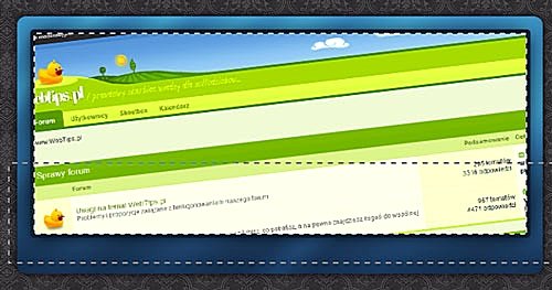
Holding CTRL and click on layer thumbnail. Then right click on selection and choose Transform Selection. Transform it as it is presented below:
![]()
On the new layer fill new selection with white. Then add Gaussian Blur filter with radius 25-50. It depends on how light menu should be. Duplicate layer few times and try to experiment with opacity.
Step 4:
With Horizontal Type Tool insert some text using font Lucida Fax. To the text layer add style:

Using Rounded Rectangle Tool create submenu. To the layer add style: (Gradient colors: #c35a0c, #ffae00)


Now we have:

Step 5:
It’s very important step. In order to make our submenu more interesting we’ll add some oblique gradients. CTRL+Click on layer thumbnail and using Gradient Tool make some gradients. You can press SHIFT while drawing to make sure that gradients will parallel to each other.


You can erase gradients on the edges. Set layer opacity to 17%;
Step 6:
I found some icons on the Web and added some submenu positions. You can place there anything you want. As you can see, the submenu title isn’t visible, so using Horizontal Type Tool place it. I made a search box on the right side of menu, simply because I wanted not to leave so much space, but if you have a very large menu it isn’t needed.
Step 7:
With Rounded Rectangle Tool make box and set style: (Gradient colors: # 0a324c, #0088b5)


Now do as we did in 5.step, but gradients can be thicker.

Step 8:
Find any image, crop it and place over the slider’s background. Add style: (Stroke color: #072231)

Now CTRL+Click on layer thumbnail and using Rectangular Marquee Tool with option Intersect with selection select a bottom part.

Create new layer, fill the selection with black and change opacity to 80-90%; add some text.
Step 9:
With Pencil Tool make some dots. Add them style: (Color: #072638)


The “selected” dot has color: #73a7bf and additional style:

Step 10:
With Rounded Rectangle Tool create box. Add style: (Gradient colors: #da690e, #e3b410)


Do as in 5.step with gradients. Add title (Lucida Fax, 14pt), text layer style:

Find some photos on Google and add them the same stroke as in 8.step
Step 11:
By now, our tutorial is finished. I taught you basis, but if you want to add some new modules (Login box, Gallery slider) I give you colors I used:
Log inbox: #cec0a5, #f7f6ef;
Gallery slider: #410c1e, #ec4a7c;
Twitter: #bbc9cf, #dee8ec;
Final Product

Hope you enjoy this tutorial.
If you have any suggestion then pleases comment below. Have a nice day… 😀
Credit: www.psdeluxe.com

nikos lianeris
Posted at 20:41h, 16 Octobervery nice tutorial!Thank you for the post!! 🙂
Clipping Path Designer
Posted at 06:12h, 17 OctoberThanks nikos for your comment. Keep visit our blog & you will get upcoming awesome tutorials. 🙂
Balaji
Posted at 11:37h, 23 Octobervery useful tutorial , thanks for sharing
Arifur Rahman
Posted at 14:28h, 23 OctoberThanks Balaji for your comment. Keep visit our blog & you will get upcoming useful tutorials… 🙂