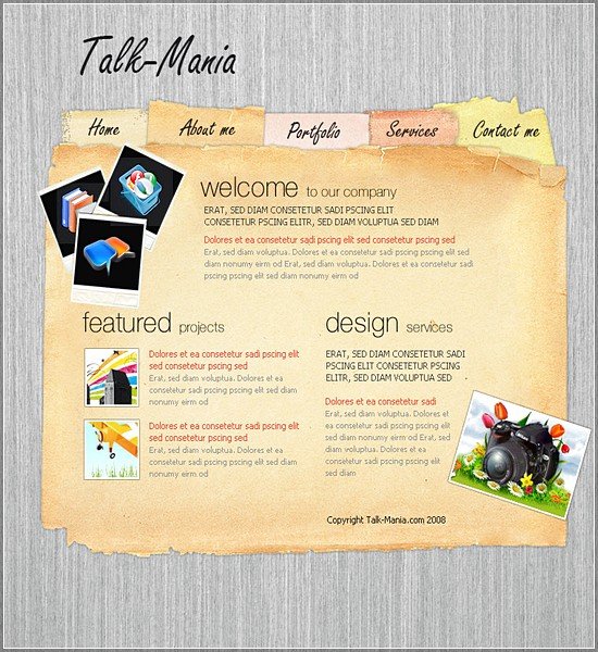
24 Oct Old Paper Layout in Photoshop

Today we are going to learn about how to create old paper web layout in Photoshop. This tutorial I will show you how easy is to create a great layout with a simple old paper texture image. I think it may help you to create your own blog more stylish. So, let’s start…
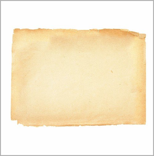
To create this layout you need a papyrus image, or an old paper image. When you have such an image, place that image on the middle of your layout.
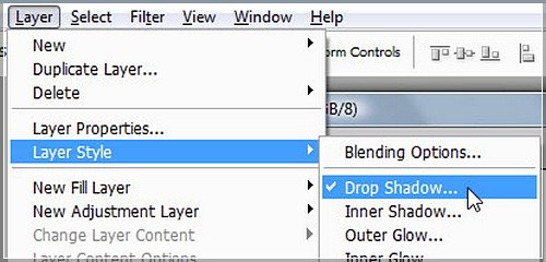
For this layer please add a simple shadow. to add a shadow please be sure you have the layout selected, then go to Layer > Layer styles > Drop Shadow.
And add the following settings
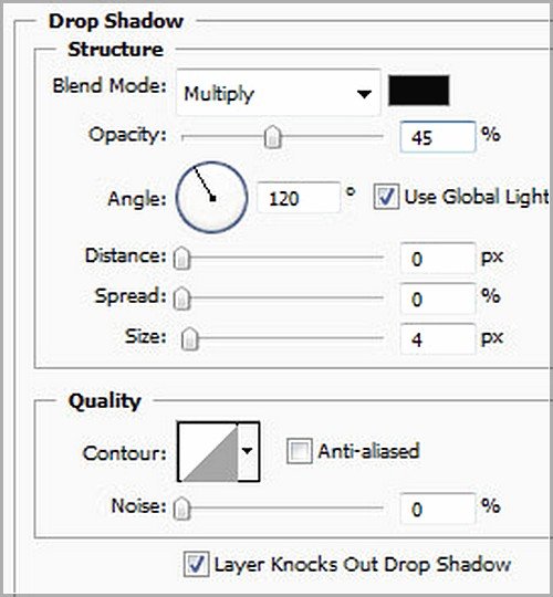
This is my result: nothing to fancy, but remember, each simple detail will result in a great looking layout
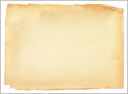
With Polygonal Lasso Tool, create a selection like in the following image.
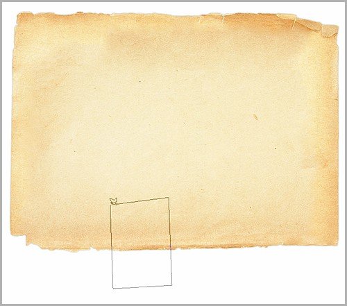
With this selection we will create some buttons. Be sure you have the first layer selected
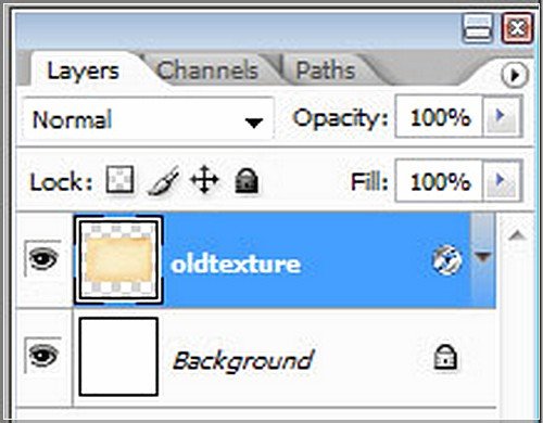
Then press on CTRL+J
You will see another layer above the first one. I will rename this layer button
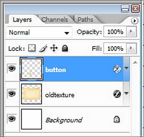
Select this layer button, and go to Edit > Transform > Rotate 180
With move tool place the small button on the top of the layout
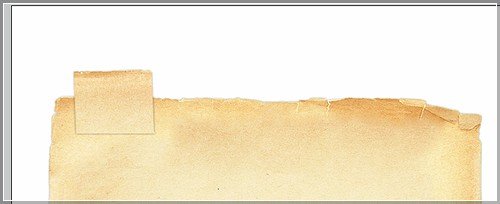
Then drag this layer right above the background layer
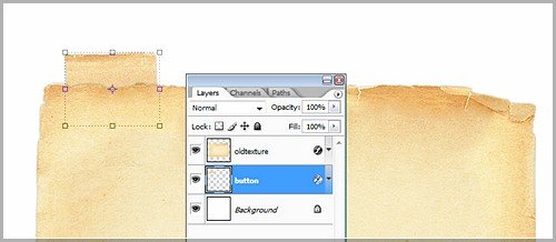
Repeat the steps from above until you place as many buttons as you need
This is my result

Add some text:

I want to change the colors for this buttons. The easy way is to use the HUE / Saturation option
To bring up the Hue saturation window, be sure you have the first button selected, and then press on CTRL+U
Use the following settings if you want to use the same colors,
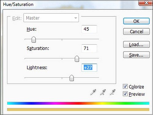
This is my new button:
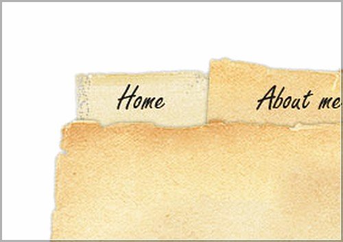
Now change alone the colors for each button. This is my buttons

Now it is time to add some text and images on your layout. This is a very simple task and I don’t think you will have problems

The layout is already looking quite good, but I think it will be nicer if we will add a good background. You can download the background from here.
Download this image and place it right above the background layer
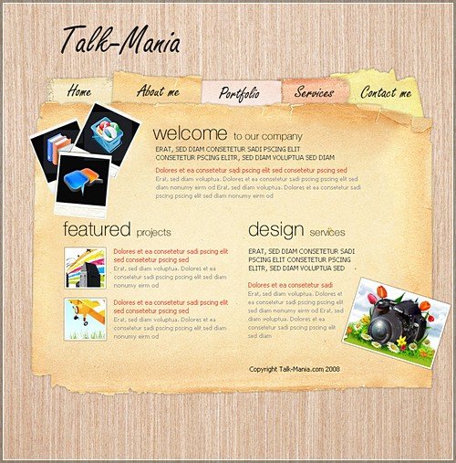
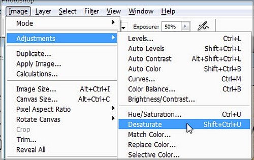
I don’t like the actual image because it doesn’t have the contrast I want. But I will desaturate this background image and i will have a nicer look. to
desaturate a layer, please go to Image > Adjustments > Desaturate
Final Result:

I hope you like this tutorial. I would really appreciate if you like this technique.
You can leave your comment and suggestions below.
Have fun… 🙂
Credit: talk-mania.com

Fannie
Posted at 19:31h, 30 SeptemberSuperior thinking demonstrated above. Thanks!